

Hello, everyone.
We offer a full-service management solution that handles every aspect of your Rakuten Ichiba store,
I'm Kodama, a graphic and web designer at Hide & Seek, Inc.
In this article, we’ll share some design tips for improving click-through rates, using a sample banner ad for “hide & seek” as an example.
What is a banner ad?
When you're browsing the internet, have you ever noticed the eye-catching images on the right or at the bottom of the page?
When you click on that image, it takes you to another site—that image is a banner ad.
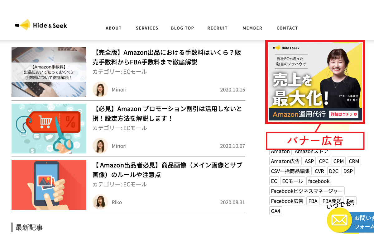
A banner ad is a general term for Internet advertisements displayed on web pages that use images or animations.
Images with links are displayed in the specified size, and clicking on them directs users to the advertiser's website.
In addition to still images, there are now many banner ads that feature motion, such as GIF animations and video ads.
While the text within images—such as captions—is important, people won’t click on them unless the design is good.
The extent to which you can improve the design quality will affect the click-through rate of your banner ads.
Point 1: Readability
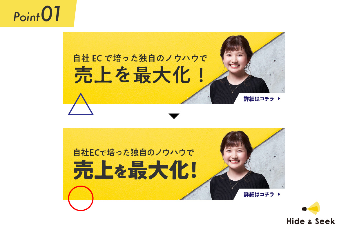
The banner ad (above) seems somewhat out of place compared to the banner ad (below), giving the impression that it’s hard to read.
So, what aspects of the banner ad (above) should be edited?
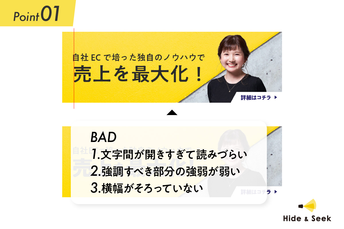
As for the banner ad (above), if you take a closer look,
① The spacing between characters is too wide, making it hard to read.
② The emphasis on the parts that should be highlighted is too weak
③ The widths aren't uniform, so it looks uneven.
There are problems like that.
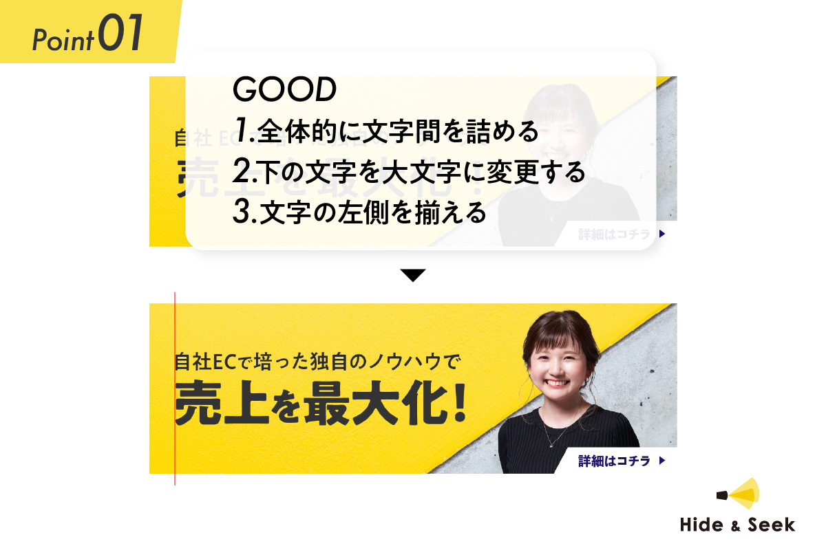
So, regarding each issue,
① Reduce the overall letter spacing
② Change the text below to bold
③ Align text to the left
If you try doing it as described above, it will look great and give a neat impression.
By adjusting the balance of the text, we improve readability, allowing consumers to grasp the information instantly.
In addition, by varying the font size—creating a contrast—between the text and the areas you want to highlight, you can add visual interest to your design.
Point 2: Text | Impression Edition
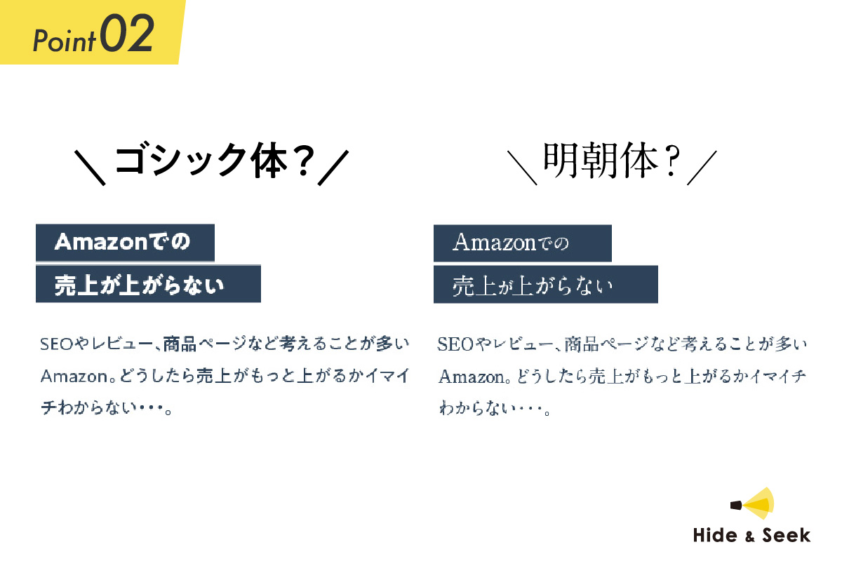
Choosing the right font is important.
Whether you use Ming or Gothic typefaces, the impression conveyed by the text can change significantly depending on factors such as size and weight.
Let's solidify the image of the worldview you want to convey and select the best font.
Point 3: Images | Photo Editing: Contrast
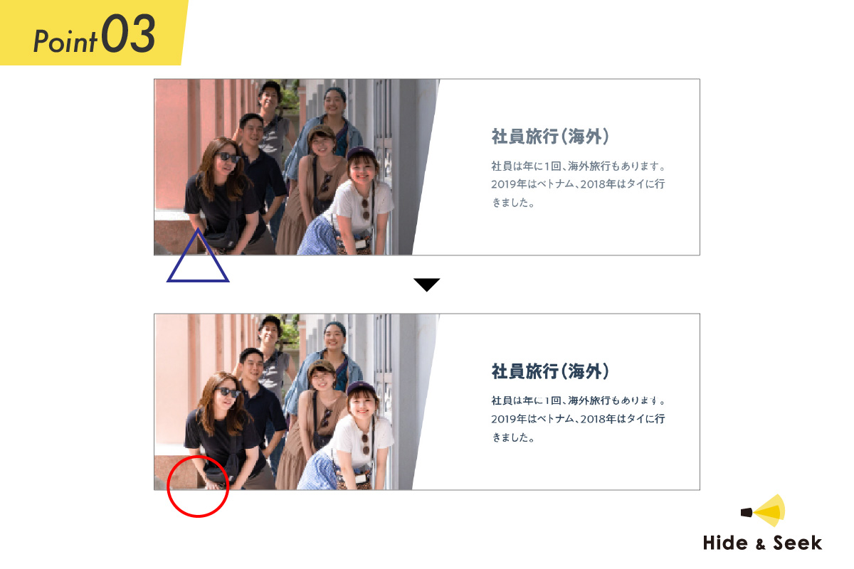
By adjusting the color tones of an image, you can create the desired look and make the text easier to read.
The greater the contrast between the background color and the text color, the better the text is to read, which makes it more user-friendly.
It's also very important to edit the image so that it matches the tone of the message.
Point 4: Images | Selection Guide
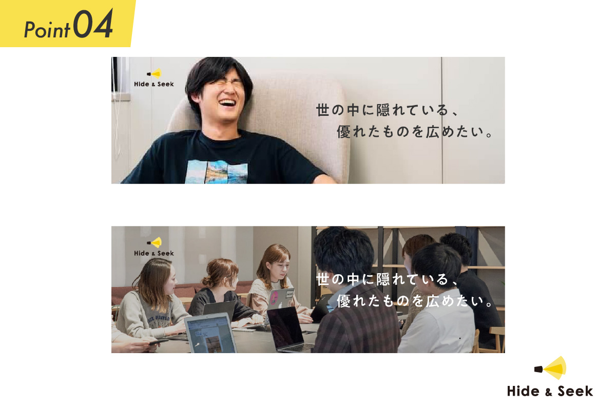
The click-through rate also varies depending on the models featured in the images.
While relevance to the product is certainly important, results show that click-through rates are higher for women than for men, and that unique, eye-catching photos tend to get more clicks than safe, unremarkable ones.
Point 5: Colors | Color Combinations
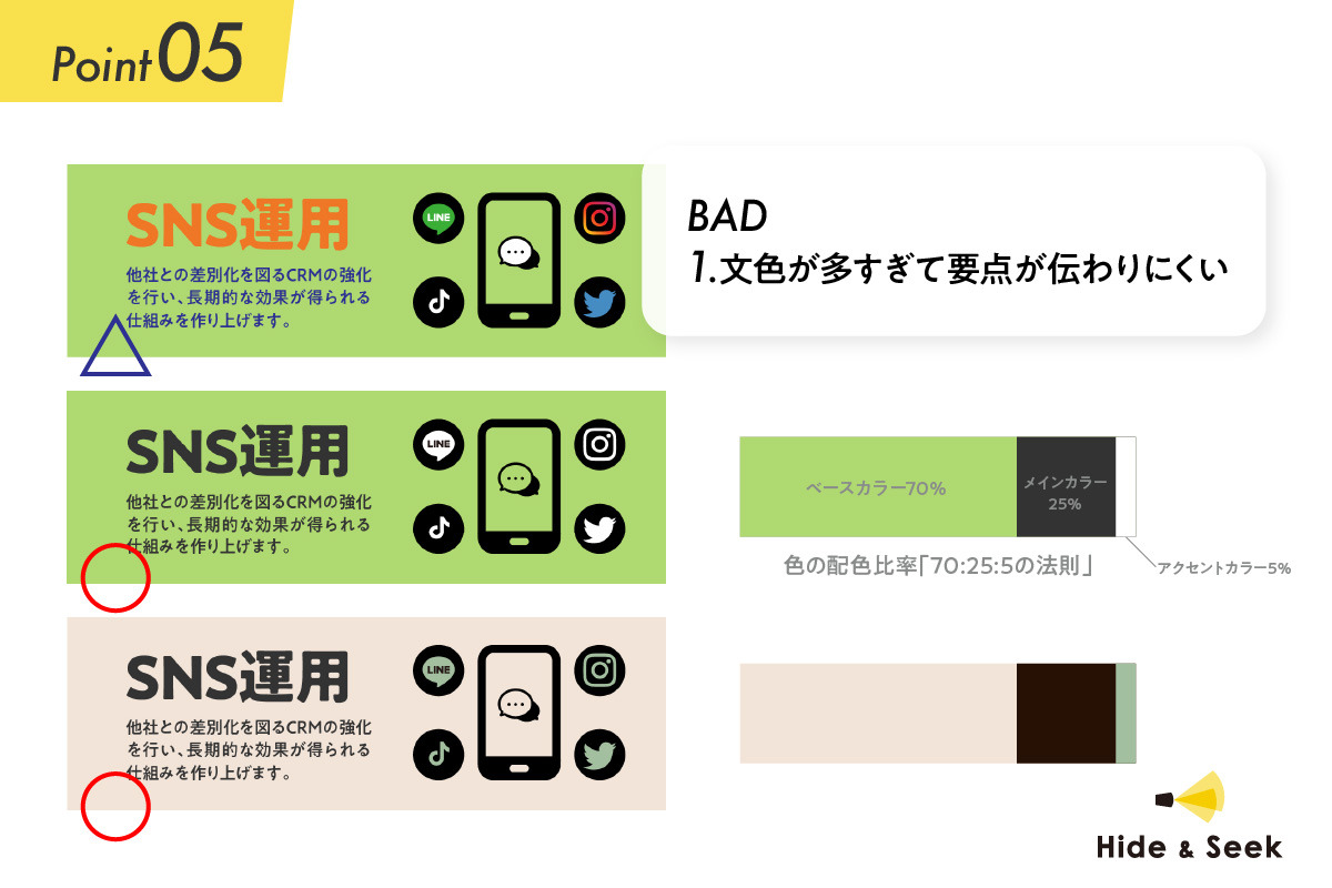
The basic color scheme consists of the “Base Color 70%,” “Main Color 25%,” and “Accent Color 5%.”
If you maintain this ratio, you'll be able to create a cohesive design.
If you use too many colors, it becomes difficult to convey the main points.
While you can sometimes incorporate a variety of colors, it’s generally safer to stick to designs that follow the basics of color theory when you’re just starting out.
Point 6: Shapes | Selection
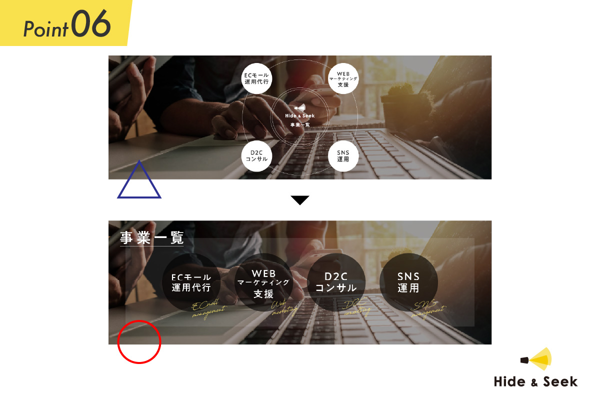
The banner ad shown above, which uses a circular shape and seems like it would boost both impact and style, actually lacks a bit of practicality.
"Banner ads" are widely used on social media these days.
For example, while the circular format works well for banners with proportions close to a square, it doesn't fit well when resized for landscape-oriented ad spaces.
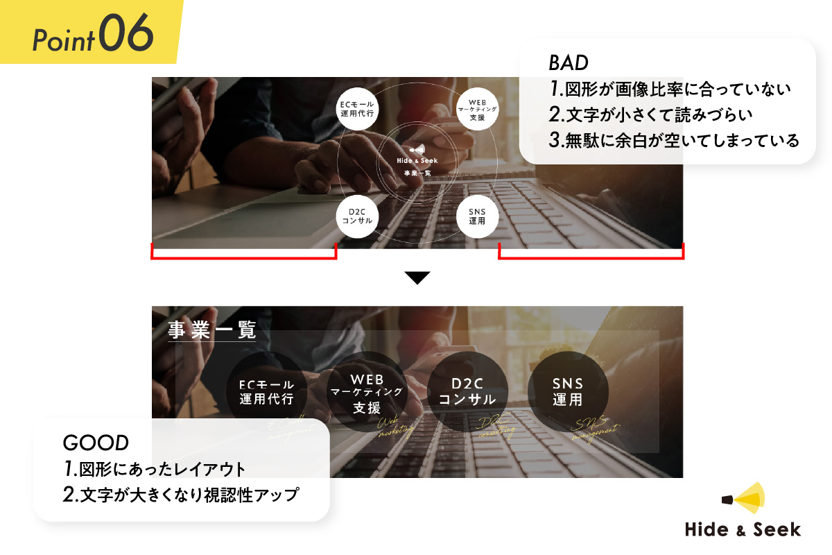
To match the horizontal rectangle, it’s a good idea to change the shape—for example, from a circle to a box, as shown in the banner below.
In addition, by selecting shapes that are appropriate and complement the product, you can convey a more positive image.
Point 7: Organizing Information | Prioritization
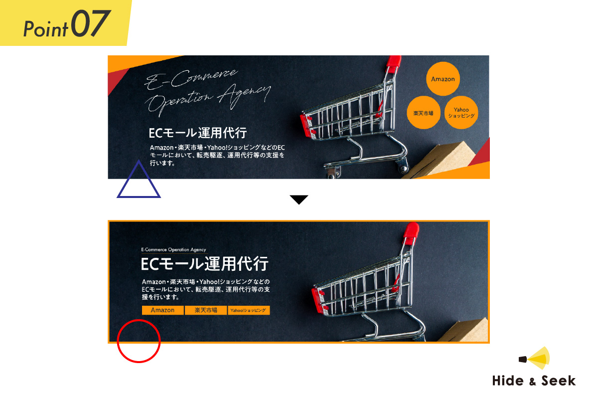
To ensure your message comes across clearly within a small space, be sure to organize the necessary information and elements effectively.
By taking the design on the left, removing unnecessary embellishments, adding the treatment scenes you want to highlight, and adjusting the visual presentation to prioritize the text, you can create highly effective creative work.
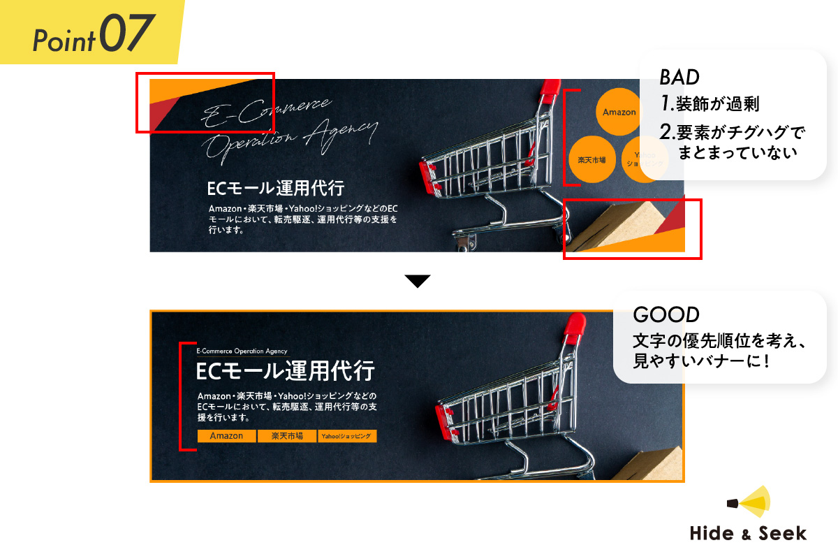
Point 8: Screen Layout
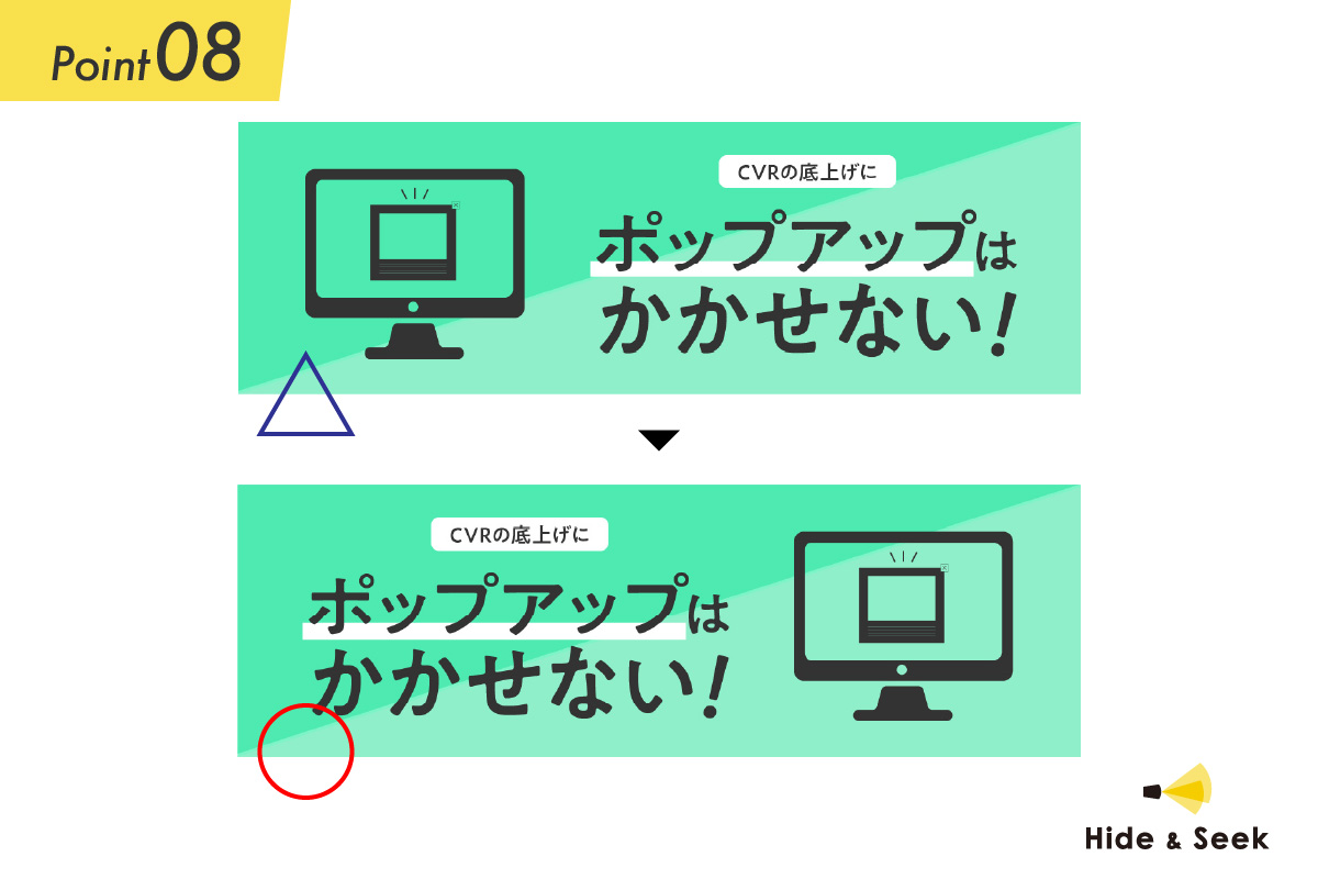
People tend to look at things from left to right.
So, if you want to emphasize the copy, for example, it’s better to place the copy—rather than an image—at the beginning of the viewer’s line of sight; that way, the message will be more easily absorbed.
Point 9: Arrangement and Grouping
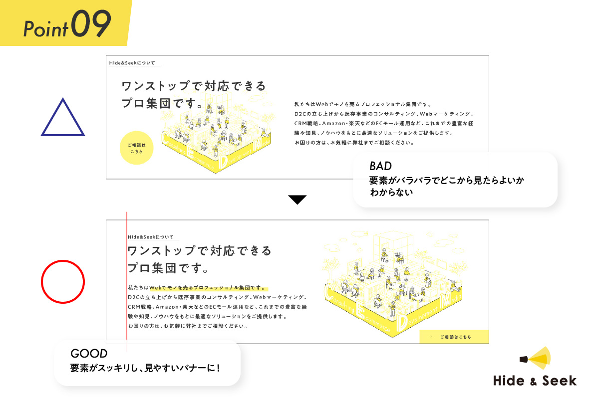
Since the elements are scattered, I'll group them together to create a focal point.
In addition, placing a large, circular eye-catcher on the left can help draw the user's attention.
Point 10: Screen Layout | Margins
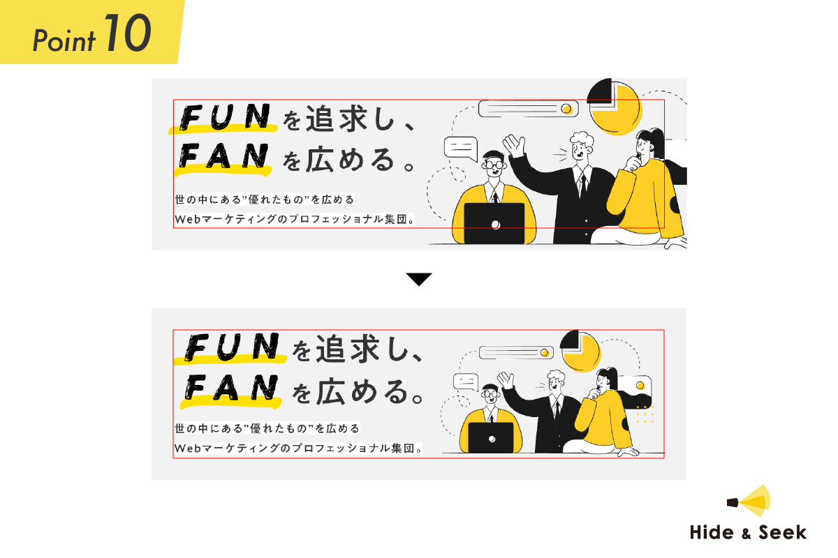
Aligning the margins of each group—top, bottom, left, and right—makes the layout look neat.
Ultimately, please check it for yourself.
While there are techniques that create a strong visual impact by deliberately going outside the lines, it’s generally safer to follow the guidelines unless you have a specific purpose in mind.
Finally
I’ve covered various design tips, but the main point I want to make is that anyone can create a good banner ad as long as they focus on the essentials.
Let's arrange the elements with readability and clarity in mind.
I'm sure you'll be able to create a great banner ad!